Crime taxonomy · Axes and scales
Aspect ratio stretching
Squashing or stretching the chart until the slope says what you want.
What it looks like
The chart is made very tall and narrow to make a trend look steep, or very wide and flat to make it look negligible.
Example
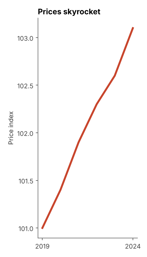 STRETCHED CHART
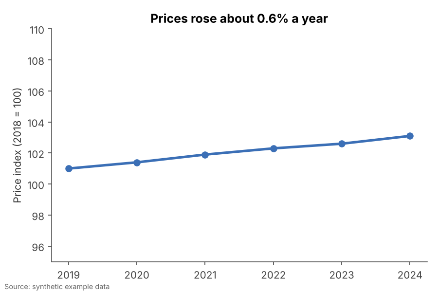 FIXED
FIXEDWhy it is bad
- Slope is the first thing readers see in a line chart, and slope depends entirely on the chart's proportions.
- Paired with a tight axis range, a few tenths of a percent can be drawn as a cliff.
How to fix it
- Use a neutral aspect ratio, roughly wider than tall, so the main slopes sit near 45 degrees.
- Pick an axis range that includes meaningful reference levels, not just the data's own min and max.
- State the rate of change in words so the shape is not doing all the talking.
When it is not a crime. A tall chart for a long ranked list, or a wide chart for a long time series, is fine when it is chosen for legibility.