Crime taxonomy · Drawing and geometry
Inappropriate chart type or encoding
A chart type that hides the comparison it is supposed to show.
What it looks like
The chart form fights the data: a pie with a dozen slices, a line connecting unordered categories, a stacked chart where the interesting series floats on a wobbly base.
Example
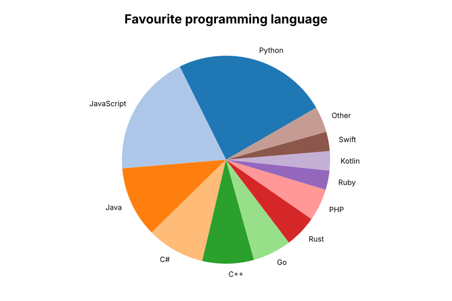 WRONG CHART TYPE
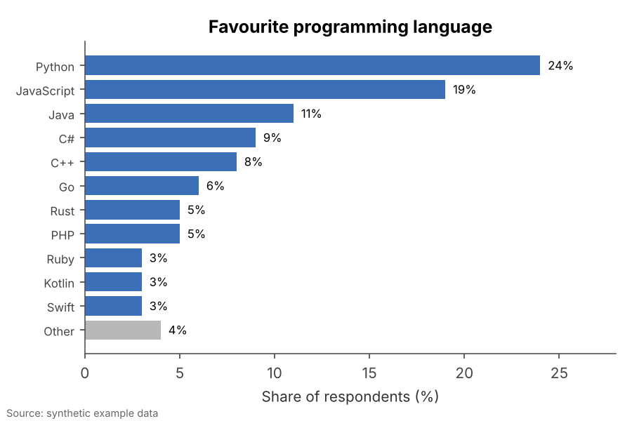 FIXED
FIXEDWhy it is bad
- People are poor at comparing angles and areas, so many-slice pies make rankings unreadable.
- A line between categories implies a sequence or trend that does not exist.
- It is usually careless rather than malicious, but readers still walk away with the wrong idea.
How to fix it
- Use sorted bars for comparing categories, lines for change over time, scatter plots for relationships.
- Keep pies to two to four slices, if at all.
- Group small categories into "Other" and show it last.
When it is not a crime. A two-slice pie (yes/no, share of a total) is perfectly readable.