Crime taxonomy · Drawing and geometry
Visual does not match the data
The picture disagrees with the numbers printed on it.
What it looks like
Bar lengths, slice angles, icon sizes or point positions do not match the labels next to them. Often the numbers are real and only the drawing is inflated.
Example
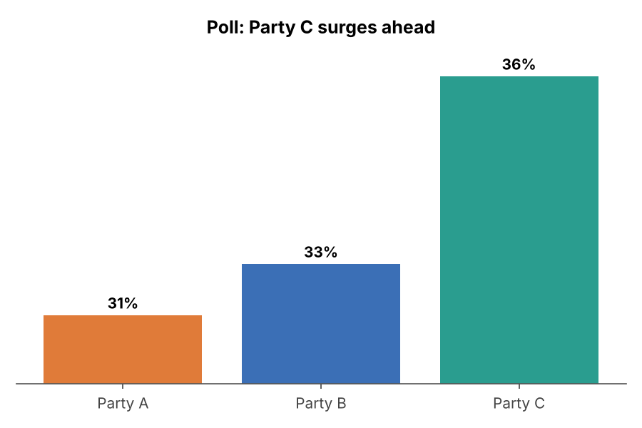 FAKE PROPORTIONS
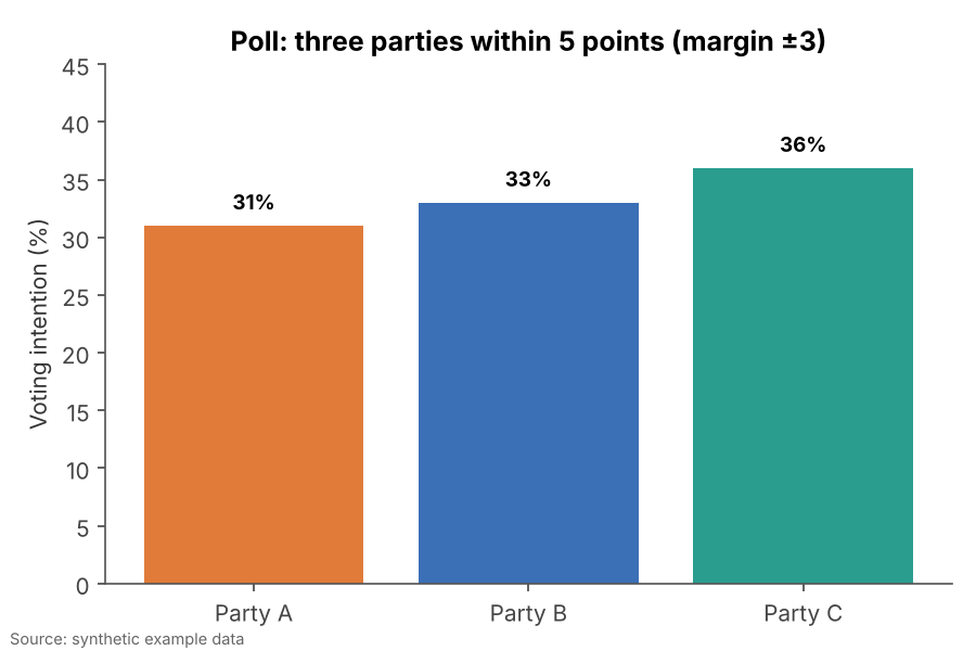 FIXED
FIXEDWhy it is bad
- Most readers trust the picture and skim the numbers, so the drawing wins.
- It is rarely an accident: someone had to draw the shapes by hand or override the data.
- This is the strongest signal of deliberate manipulation in the whole taxonomy.
How to fix it
- Generate charts from the data, never by hand-adjusting shapes.
- Check that every drawn length, angle or area is proportional to its label.
- If a value is too small to see, annotate it rather than inflating it.
When it is not a crime. There is no innocent version of this. Small rendering rounding is not a crime; visible disagreement is.