Crimes against data
Charts are evidence.
Some of them are forged.
Chart Police inspects charts for truncated axes, rigged scales, cherry-picked data and 13 other ways a picture can lie about its numbers, then tells you plainly whether you are looking at a chart crime.
Now in private testing. Public launch soon.
Why Chart Police exists
Misleading charts are cheap to make and fast to spread. Now they are being mass produced.
A chart looks like proof. It borrows the authority of numbers, and people take in its shape in a second, long before they read the axis labels. That is exactly what makes a dishonest chart so effective: the numbers can all be correct while the picture tells a different story.
Bending a chart used to take some effort and some skill. Today an AI assistant will turn any spreadsheet, or any claim, into a polished, official-looking chart in seconds, with whatever axis range, baseline and headline you ask for. It will also make the classic mistakes by default: raw totals on maps, pies that add up to 115%, titles that overstate the trend.
The result is more charts than ever, made by more people, checked by fewer. Corrections cannot keep up. Chart Police is built to help close that gap: to make checking a chart as quick as making one.
- Made in seconds. Generative tools produce convincing charts on demand, misleading ones included.
- Shared in minutes. A screenshot travels without its article, its source or its caveats.
- Believed at a glance. Readers judge the shape first. A distorted shape is remembered long after the correction.
- Rarely checked. Spotting a rigged axis takes training most readers never got.
How it works
Report a suspicious chart. Get a verdict and the fix.
- 1
Report
Hand over a screenshot or an image of any chart or map, from a news site, a slide deck or a social feed.
- 2
Inspect
The chart is examined against a taxonomy of 16 chart crimes, from truncated axes to distorted map projections. Each finding comes with the evidence.
- 3
Verdict
Findings combine into a 0–100 crime score and a verdict. Every finding comes with how to fix the chart.
Verdicts on the crime score. From 45 up, it is a chart crime.
- 0–19Not a chart crime
- 20–44Questionable, but not a crime
- 45–69Chart misdemeanor
- 70–100Chart felony
The crime taxonomy
16 ways a chart can lie
Each crime has its own page explaining what it looks like, why it misleads, an example, and how to fix it. Browse the full taxonomy →
Axes and scales
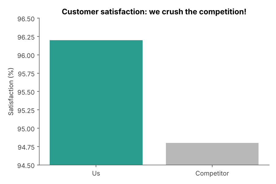 TRUNCATED AXIS
Truncated or non-zero baseline
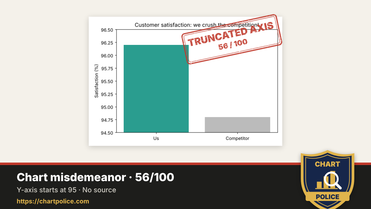
Cutting off the bottom of a bar chart so small differences look huge.
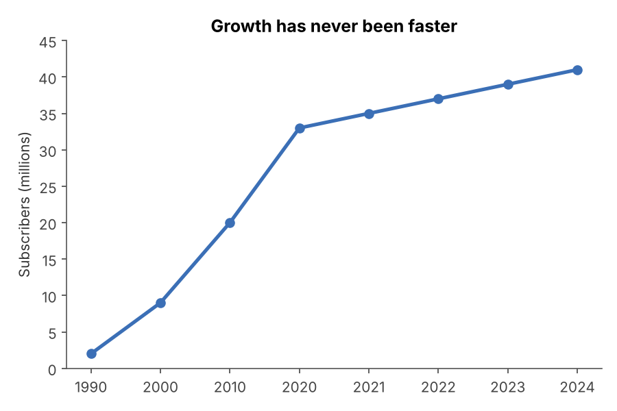 RIGGED SCALE
Manipulated axis scale
Uneven, inverted or hidden scales that bend the trend.
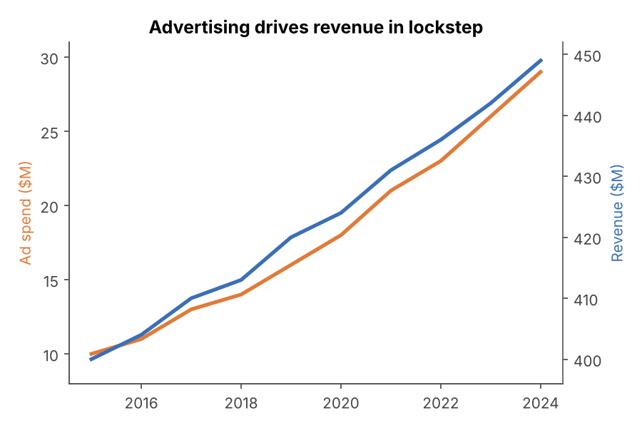 DUAL-AXIS ABUSE
Dual-axis distortion
Two series on two independent axes, scaled to tell whatever story you like.
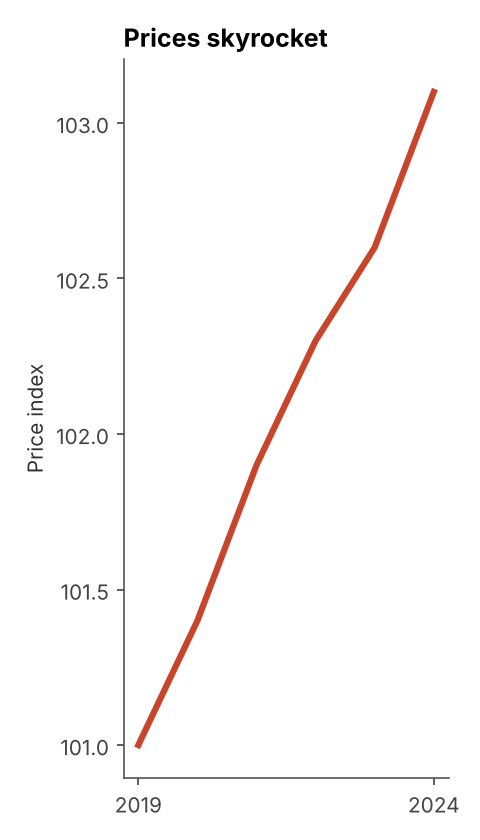 STRETCHED CHART
Aspect ratio stretching
Squashing or stretching the chart until the slope says what you want.
Drawing and geometry
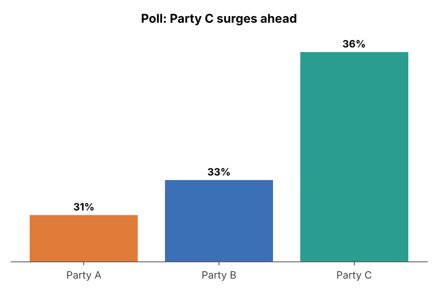 FAKE PROPORTIONS
Visual does not match the data
The picture disagrees with the numbers printed on it.
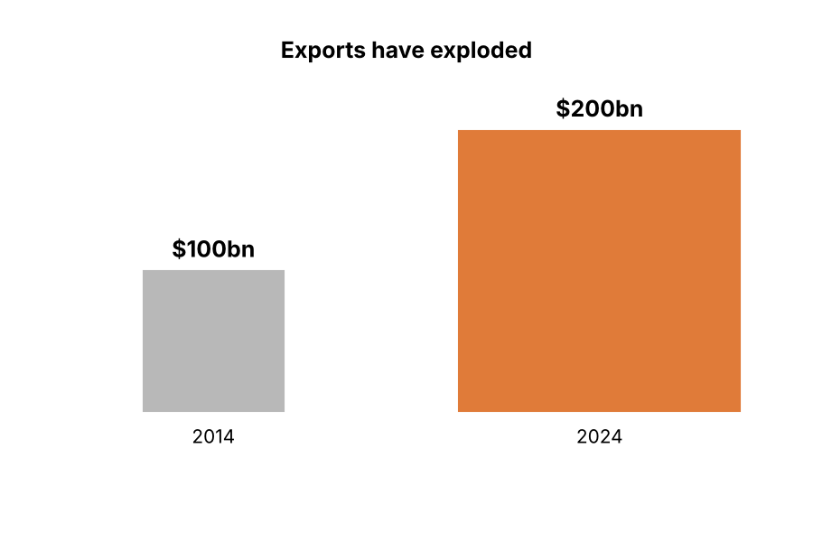 3D DISTORTION
Area, volume or 3D distortion
Scaling icons, bubbles or 3D shapes so a doubling looks like a quadrupling.
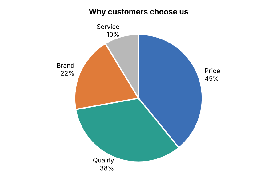 BROKEN WHOLE
Part-to-whole error
Pies and stacks whose parts do not add up to the whole.
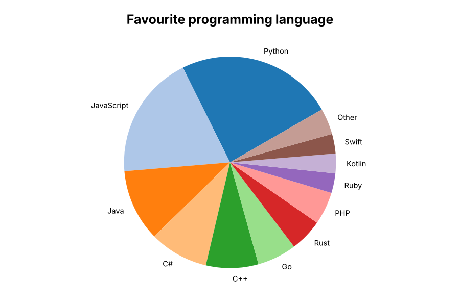 WRONG CHART TYPE
Inappropriate chart type or encoding
A chart type that hides the comparison it is supposed to show.
Data selection
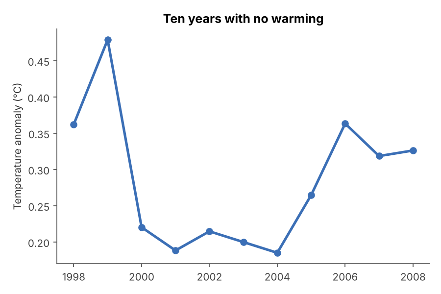 CHERRY-PICKING
Cherry-picked range or omitted data
Showing only the slice of data that supports the story.
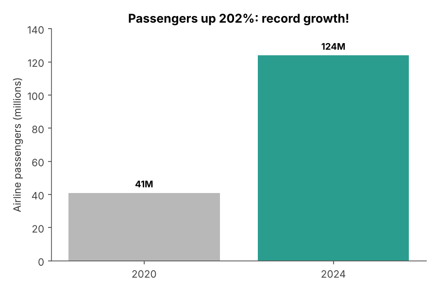 OUTLIER BASELINE
Outlier reference point
Measuring change from an abnormal year, like the 2020 lockdowns.
Words and context
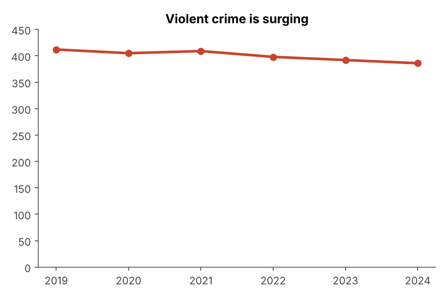 MISLEADING LABELS
Misleading title, labels or annotation
A title or annotation that says something the data does not.
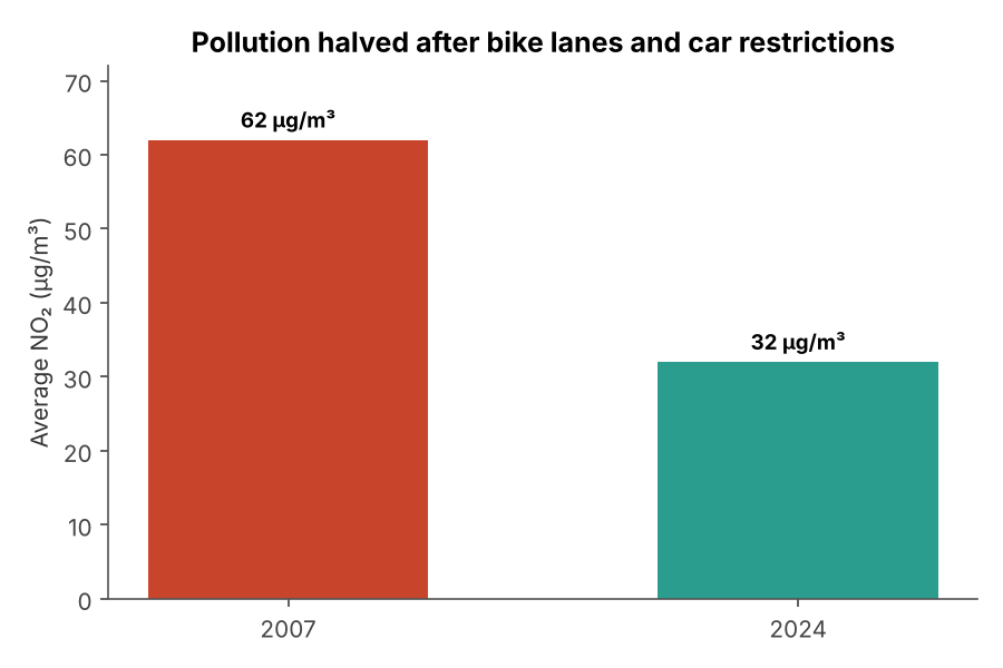 UNPROVEN CAUSE
Incorrect or unsubstantiated attribution
Crediting a change to a cause the chart cannot prove.
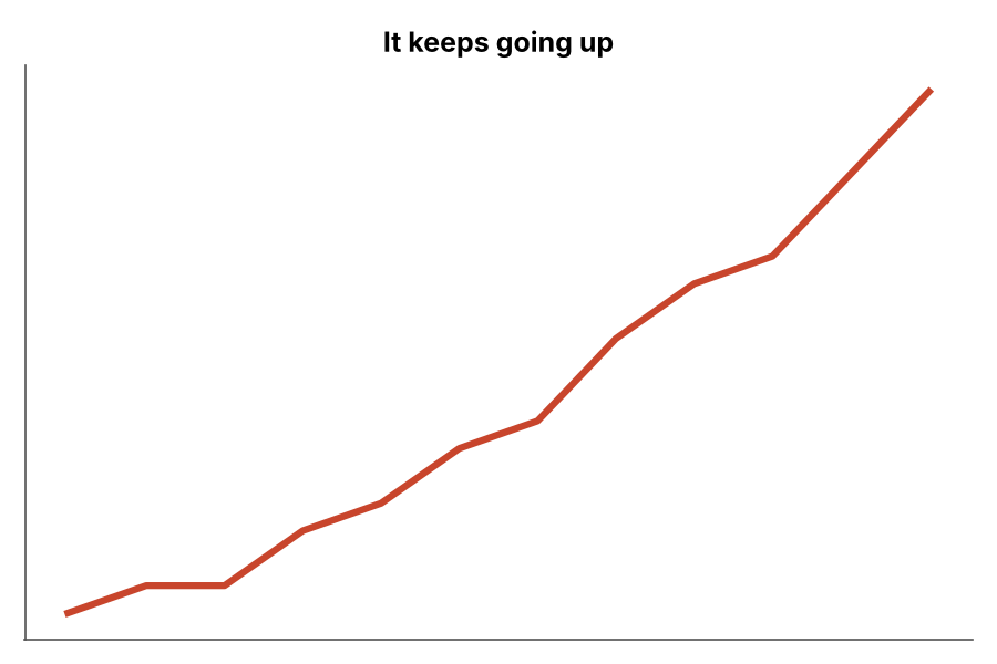 MISSING CONTEXT
Missing context
No axes, no units, no source, nothing to compare against.