Crime taxonomy · Maps and colour
Raw totals on a map
A map of raw counts that is really a population map.
What it looks like
A choropleth shows totals (cases, crimes, sales) where a rate is needed, so the map mostly shows where people live.
Example
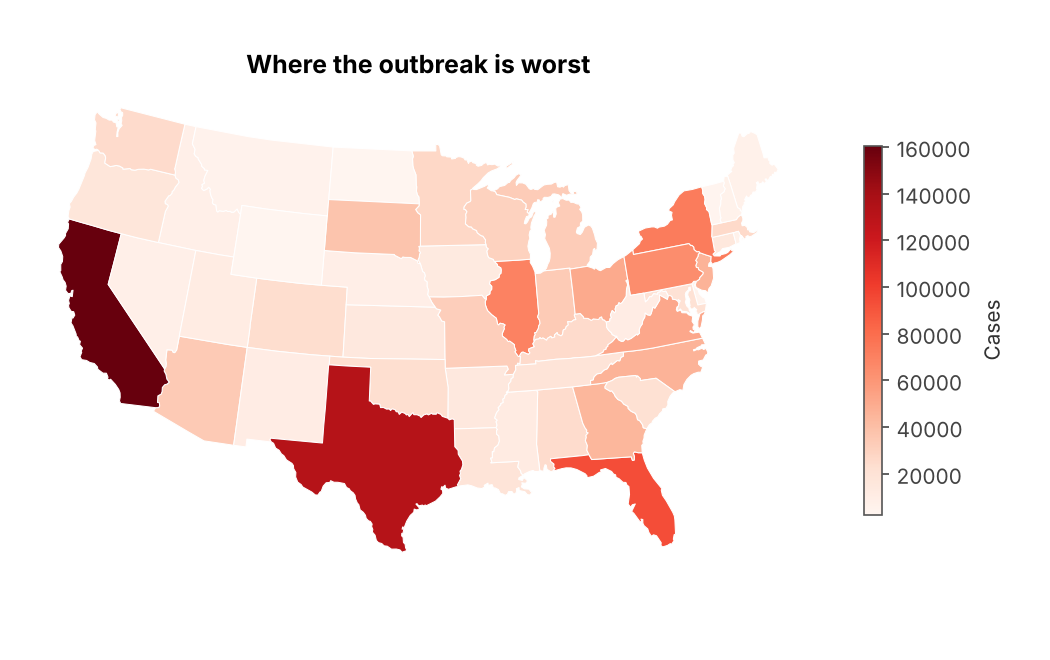 RAW-TOTALS MAP
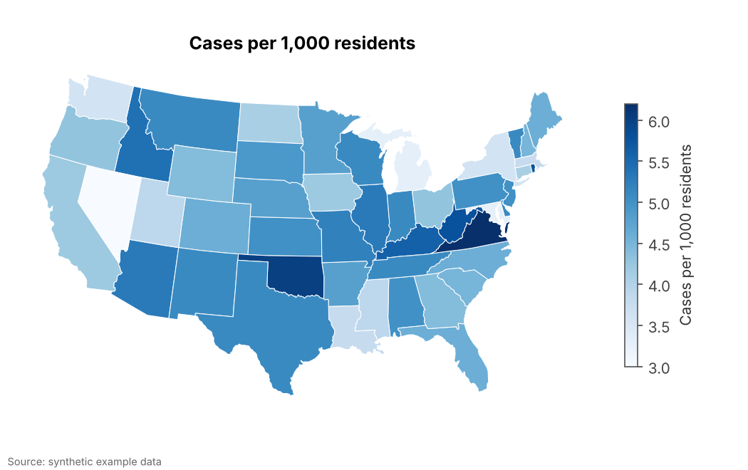 FIXED
FIXEDWhy it is bad
- Big populous regions always have the most of everything. The map says nothing about risk.
- It is one of the most common map mistakes, and AI tools make it by default when given raw counts.
- A dramatic title turns the population pattern into a false story about "hotspots".
How to fix it
- Map rates (per capita, per household, per km²) on choropleths.
- If totals matter, use proportional symbols on a neutral base map instead of filled areas.
- Say in the legend exactly what is normalised by what.
When it is not a crime. Mapping totals is fine when the total is the point (e.g. where to send supplies), shown with symbols rather than shaded areas.