Crime taxonomy · Maps and colour
Distorting map projection
A projection that makes some places look far bigger than they are.
What it looks like
A world map in Mercator (or another non-equal-area projection) used for comparing areas or for a choropleth, or regions resized, clipped, moved or dropped so their visual weight is wrong.
Example
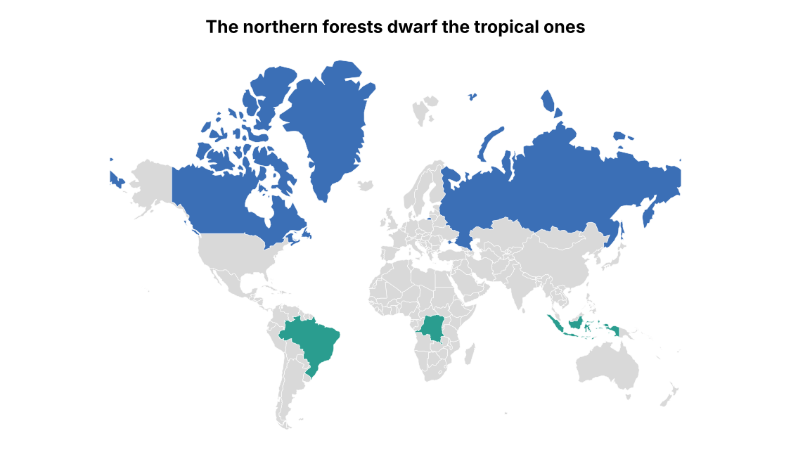 MAP DISTORTION
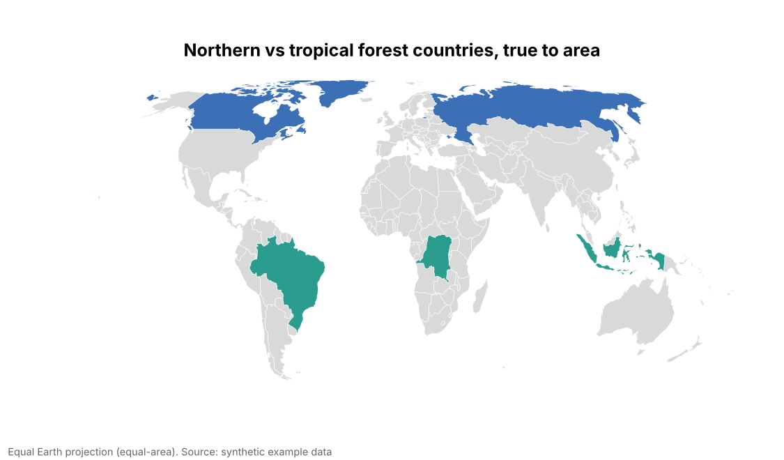 FIXED
FIXEDWhy it is bad
- Mercator inflates high latitudes: Greenland looks as large as Africa, which is 14 times bigger.
- On a choropleth, bigger areas get more colour and more attention, so the projection itself biases the reading.
- Insets and omitted regions quietly change what counts as "the whole".
How to fix it
- Use an equal-area projection (Equal Earth, Albers, Mollweide) for world choropleths and area comparisons.
- Name the projection in the caption.
- Show insets for far-away regions at a stated scale rather than dropping them.
When it is not a crime. Mercator is right for navigation and street-level web maps, where preserving angles matters more than areas.