Crime taxonomy · Axes and scales
Dual-axis distortion
Two series on two independent axes, scaled to tell whatever story you like.
What it looks like
Two lines share a chart but each has its own y-axis. Because each axis range is chosen freely, the lines can be made to overlap, cross or diverge at will.
Example
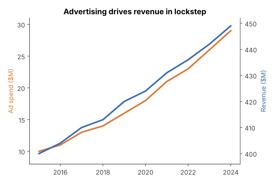 DUAL-AXIS ABUSE
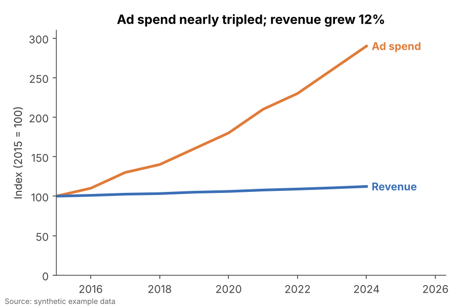 FIXED
FIXEDWhy it is bad
- Any two rising series can be made to look perfectly correlated by stretching one axis.
- Where the lines cross means nothing, yet readers treat it as a turning point.
- It invites a causal reading ("A drives B") that the data never tested.
How to fix it
- Index both series to a common starting point (e.g. 2015 = 100) and use a single axis.
- Or draw two charts side by side, each with its own honest axis.
- Or plot one against the other in a scatter plot if the relationship is the point.
When it is not a crime. A second axis that is a pure unit conversion (°C and °F, km and miles) does not distort anything.