Crime taxonomy · Maps and colour
Misleading colour scale
Colour scales built to exaggerate, invert or invent differences.
What it looks like
Class breaks chosen to blow up tiny differences, a diverging palette centred on an arbitrary value, a saturated or truncated colour range, a reversed scale, a rainbow for ordered values, or legend colours that do not match the map.
Example
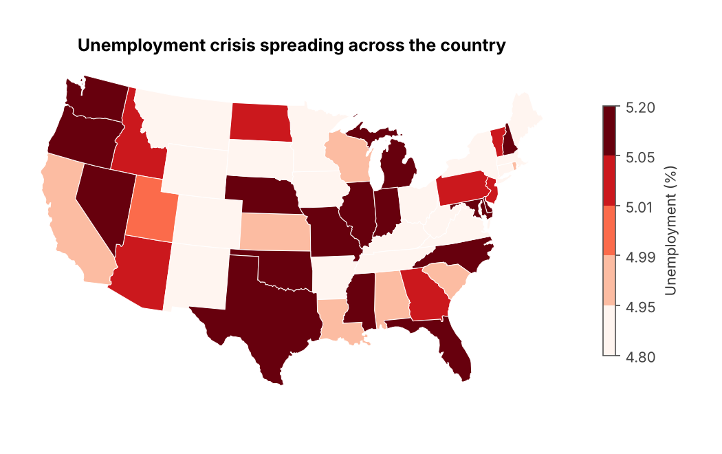 RIGGED COLOURS
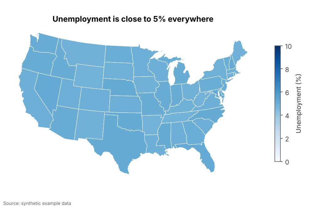 FIXED
FIXEDWhy it is bad
- Colour is the axis of a map. Tight class breaks are the map version of a truncated axis.
- Dark red reads as "crisis" whatever the legend says.
- Rainbow palettes create sharp visual boundaries where the data changes smoothly.
How to fix it
- Use a sequential palette (light to dark) for ordered values, and diverging only around a meaningful midpoint.
- Choose class breaks from the data's real spread (quantiles, round numbers) and state them in the legend.
- Avoid rainbow palettes for ordered data; they are also hard to read for colour-blind readers.
When it is not a crime. Fine-grained breaks are honest when small differences genuinely matter and the legend makes the range obvious.