Crime taxonomy · Data selection
Cherry-picked range or omitted data
Showing only the slice of data that supports the story.
What it looks like
The time window, categories or data points are selected to support a narrative, and the rest is left out. Gaps in a continuous axis are hidden instead of marked.
Example
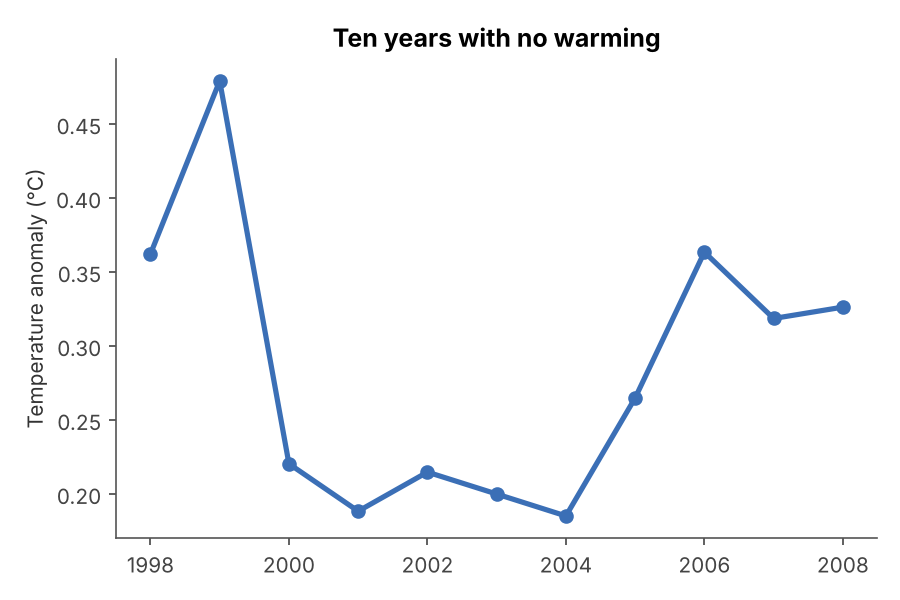 CHERRY-PICKING
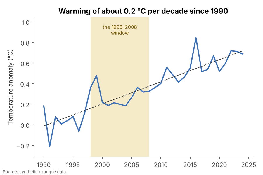 FIXED
FIXEDWhy it is bad
- Any noisy series contains a stretch that goes the "wrong" way. Show only that stretch and you can claim anything.
- The chart itself can be perfectly drawn, which makes the omission hard to spot.
- Readers cannot ask about data they were never shown.
How to fix it
- Show the longest relevant history, and highlight the period you want to discuss within it.
- Explain why the window starts and ends where it does.
- Mark gaps and excluded points explicitly rather than closing them up.
When it is not a crime. Zooming into a recent period is fine when it is labelled as such and the longer context is one click or one chart away.