Crime taxonomy · Axes and scales
Truncated or non-zero baseline
Cutting off the bottom of a bar chart so small differences look huge.
What it looks like
The value axis of a bar, column or area chart starts somewhere above zero, or is broken without a clear marker. Readers compare bar lengths, so when the bottom is cut off a 1% difference can be drawn as a 6x difference.
Example
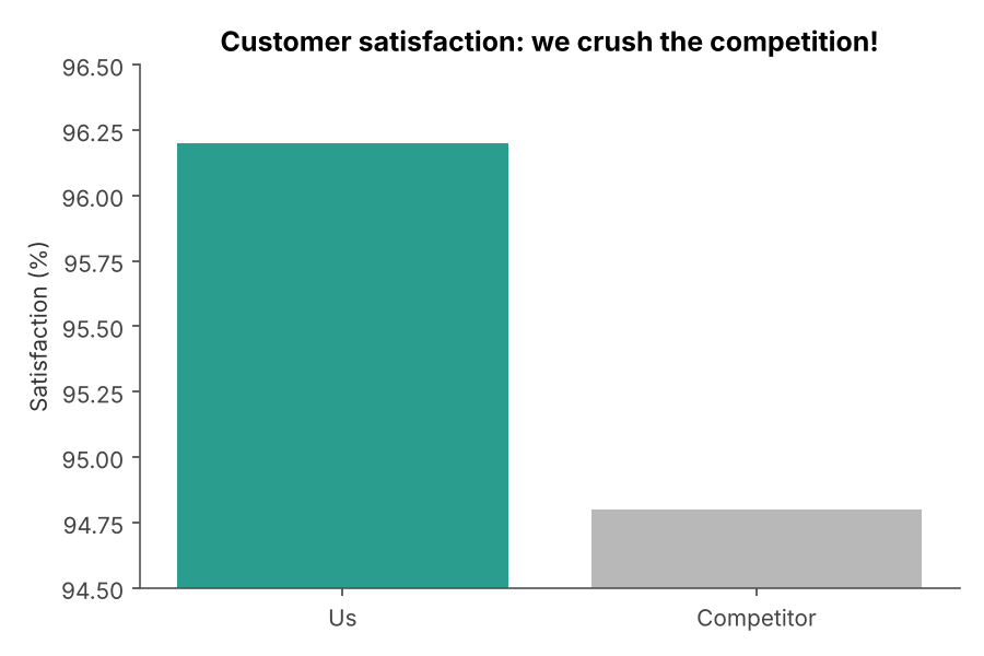 TRUNCATED AXIS
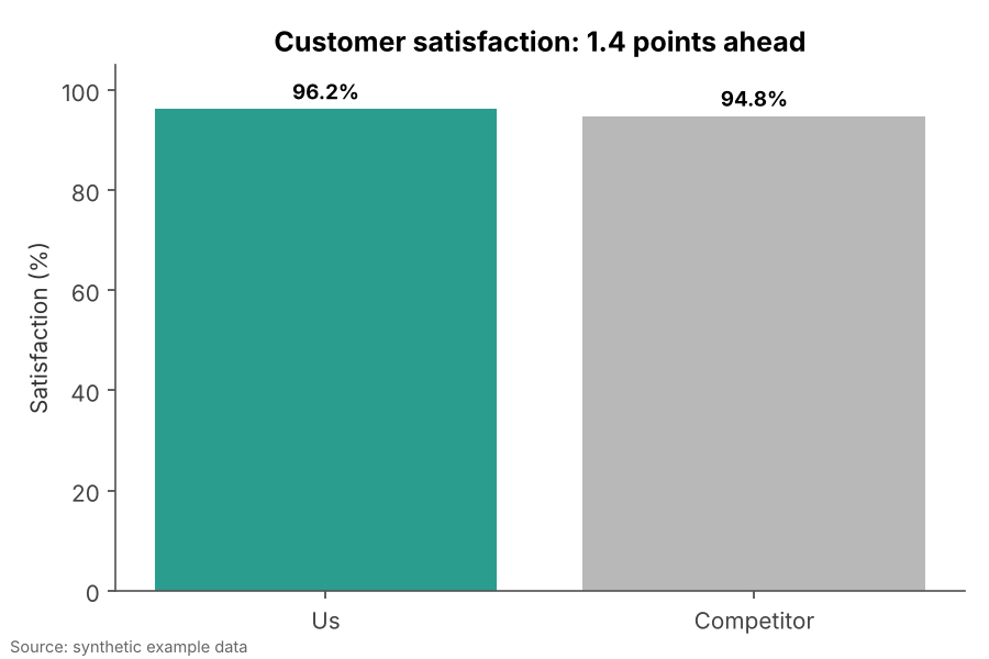 FIXED
FIXEDWhy it is bad
- Bars encode values by their length. Remove the shared base and the lengths stop meaning anything.
- The axis labels are technically correct, so the chart survives a fact check while the picture lies.
- People remember the shape, not the tick labels. The impression of a landslide sticks.
How to fix it
- Start bar, column and area charts at zero.
- If the differences are what matter, plot the differences themselves, or use a dot plot or line chart.
- If you must break an axis, draw an unmistakable break marker and say so in the caption.
When it is not a crime. Line charts and dot plots do not encode values by length, so a non-zero axis is often the honest choice there (temperatures, interest rates, body weight).