Crime taxonomy · Words and context
Missing context
No axes, no units, no source, nothing to compare against.
What it looks like
The chart leaves out what a reader needs to judge it: axis labels, units, a source, a time frame, a comparison point, or a normalisation such as per capita.
Example
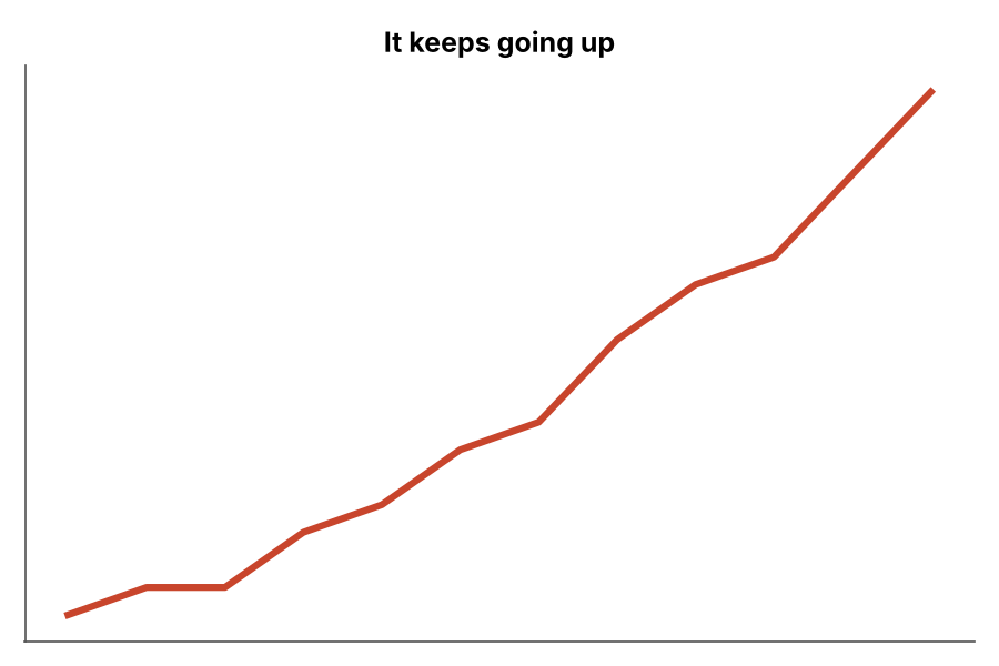 MISSING CONTEXT
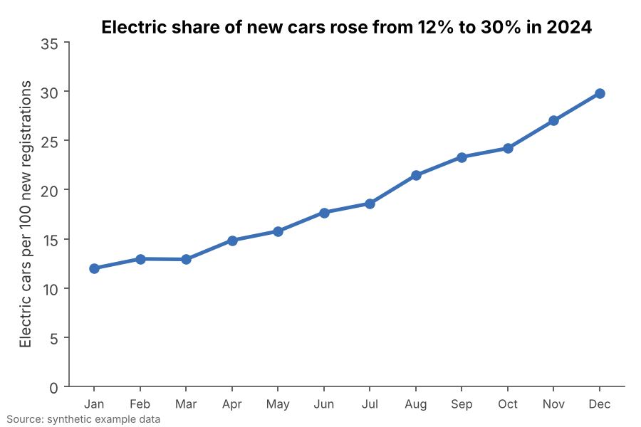 FIXED
FIXEDWhy it is bad
- Without units or a scale, a line going up could mean anything.
- Without a source, nobody can check it.
- Missing context is often harmless sloppiness, but it is also where manipulation hides.
How to fix it
- Label both axes with units, and say what the data is and when it was measured.
- Cite the source on the chart itself, since charts get screenshotted and lose their article.
- Normalise when sizes differ: per person, per sale, share of total.
When it is not a crime. Sparklines and tiny inline charts can drop axes when the surrounding text gives the numbers.